Changing Button Style Example
note_pin
Changing CSS styles require expertise. Please don't attempt to change them if you don't have the skills to do so.
You can change the style of the Buttons in the Work Portal by defining your customized CSS styles.
Customized styles must be defined in the override styles file located in
C:\Bizagi\Projects\[BizagiProject]\WebApplication\jquery\overrides\css\desktop\bizagi.custom.styles.cssThis example illustrates how to create four different styles. If you want to replicate it, you require an Internet connection.
To configure this behavior:
- Edit the
bizagi.custom.style.csslocated inC:\Bizagi\Projects\[BizagiProject]\WebApplication\jquery\overrides\css\desktop. Add the following CSS code:
.btn_msteel {
  background-image: none !important;
  background: #415a68
    url("http://www.bizagi.com/assets/images/common/btn_arrow.png") no-repeat
    15px 50% !important;
  color: #fff !important;
  padding: 3px 20px 3px 40px !important;
  border: 2px solid #fff !important;
  font-size: 21px !important;
  font-weight: 500 !important;
  font-family: Courier New, sans-serif !important;
  box-shadow: none !important;
  text-shadow: none !important;
}
.btn_msteel:hover {
  background-image: none !important;
  background: #8094a2
    url("http://www.bizagi.com/assets/images/common/btn_arrow.png") no-repeat
    15px 50% !important;
  color: #fff !important;
  box-shadow: none !important;
  text-transform: uppercase !important;
  text-shadow: none !important;
  font-size: 21px !important;
  font-weight: 500 !important;
  font-family: Courier New, sans-serif !important;
}

.btn_mteal {
  background-image: none !important;
  background: #008d7f
    url("http://www.bizagi.com/assets/images/common/btn_arrow.png") no-repeat
    15px 50% !important;
  color: #fff !important;
  padding: 3px 20px 3px 40px !important;
  border: 2px solid #fff !important;
  font-size: 22px !important;
  font-weight: 500 !important;
  font-family: Kunstler Script, sans-serif !important;
  box-shadow: none !important;
  text-shadow: none !important;
}
.btn_mteal:hover {
  background-image: none !important;
  background: #00aca2
    url("http://www.bizagi.com/assets/images/common/btn_arrow.png") no-repeat
    15px 50% !important;
  color: #fff !important;
  box-shadow: none !important;
  text-shadow: none !important;
  font-weight: 500 !important;
  font-family: Kunstler Script, sans-serif !important;
}

.btn_molive {
  background-image: none !important;
  background: #b2bb1c
    url("http://www.bizagi.com/assets/images/common/btn_arrow.png") repeat-x 1px
    50% !important;
  color: #000 !important;
  padding: 3px 20px 3px 40px !important;
  border: 2px solid #fff !important;
  font-size: 10px !important;
  font-weight: 500 !important;
  box-shadow: none !important;
  text-shadow: -1px 0 #c0c0c0, 0 1px #c0c0c0, 1px 0 #c0c0c0, 0 -1px #c0c0c0 !important;
  text-align: left !important;
}
.btn_molive:hover {
  background-image: none !important;
  background: #d6e03d
    url("http://www.bizagi.com/assets/images/common/btn_arrow.png") no-repeat
    15px 50% !important;
  color: #fff !important;
  box-shadow: none !important;
  text-shadow: none !important;
  font-size: 10px !important;
  font-weight: 500 !important;
}

.btn_morange {
  background-image: none !important;
  background: #f28d1e
    url("http://www.bizagi.com/assets/images/common/btn_arrow.png") no-repeat
    15px 50% !important;
  color: #fff !important;
  padding: 3px 20px 3px 40px !important;
  border: 2px solid #fff !important;
  font-size: 22px !important;
  font-weight: 500 !important;
  font-family: Footlight MT Light, sans-serif !important;
  box-shadow: none !important;
  text-shadow: none !important;
}
.btn_morange:hover {
  background-image: none !important;
  background: #fdb825
    url("http://www.bizagi.com/assets/images/common/btn_arrow.png") no-repeat
    15px 50% !important;
  color: #fff !important;
  box-shadow: none !important;
  text-transform: uppercase !important;
  text-shadow: none !important;
}
note_pin IMPORTANT
- The
!importanttag gives more weight to this CSS value. This tag is important in every single value to override the default style.- When you need to change the background color, add the property
background-image: none !important;.
Steps to Customize Button Styles:
-
In Bizagi Studio, drag and drop four Button controls to the form. Type the desired Button's Caption for each one.
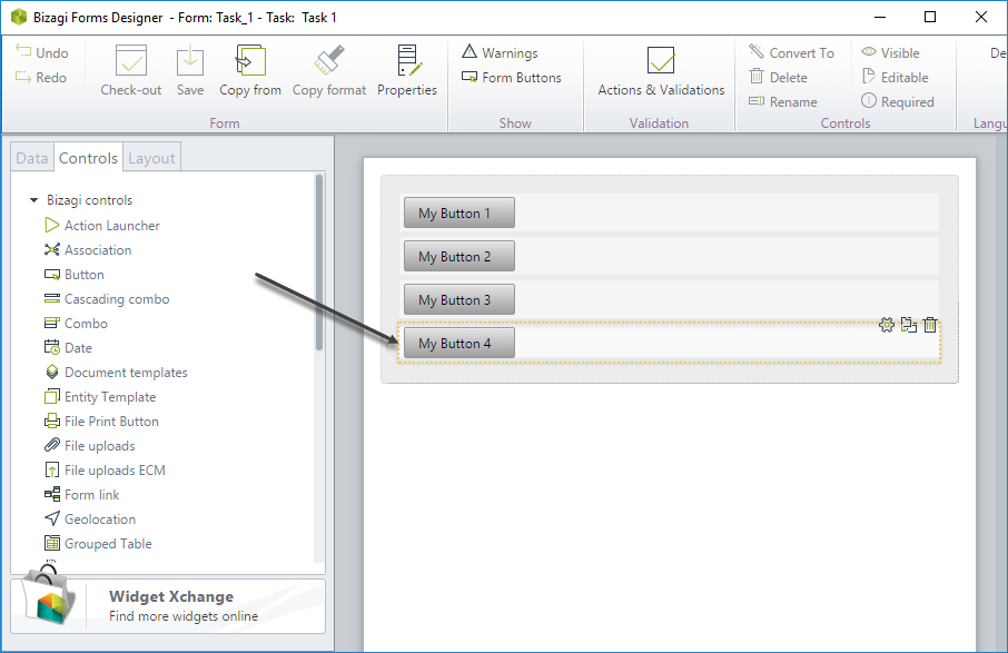
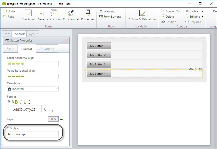
-
In the Format tab, set the following classes in the CSS Style property:
- My Button 1 >
btn_msteel - My Button 2 >
btn_mteal - My Button 3 >
btn_molive - My Button 4 >
btn_morange
- My Button 1 >
-
Go to the Work Portal and test your results.